The Topography of Searching, part 1: Not everything should be a map (but I did make this a map).
By Brett Tweedie, Digital Collections Catalyst 2021 | 29 March 2022

Digital Collections Catalyst 2021
Brett Tweedie shares his inspiration for
The Topography of Searching
What we search for reveals something about ourselves: what we don’t know, what we want to know more about, or simply what we have forgotten.
Like most nerds, I love maps. Even today, although Google maps is obviously an amazing product, I still always buy one of those large fold-out paper maps before a road trip. And I like using maps in data visualisations, and have for subjects such as showing the locations of refugee camps, ocean pools, old cinemas, hot springs, detention centres, 19th century crimes, local papers, the places used for Ikea furniture names, noodle restaurants, graffiti, hydro pipelines, and the prevalence of cardiovascular disease (amongst others). But despite all that, I didn’t actually set out to make a map-based data visualisation for this project.
I started off looking through the library’s collections and having a bit of a poke around in the open data they’d made available on the Queensland Government Open Data Portal to see what might serve as the basis for a (hopefully) interesting data visualisation. I’d initially looked at doing something with the political posters, or some sort of content analysis of Joh’s (rather lengthy) interview. But then I came across the searches people had made when using the library's catalogue and what struck me was their range: from the mundane, to the specific, the sad, the funny, the slightly odd, the typos*, and the mistakes.
Although I’d seen the (excellent) SLQ Unstacked - a “real-time visualisation of resources people are accessing from the State Library's collection” - I thought that doing something with the search terms themselves, as opposed to the results, was sufficiently different - the start of the journey, as opposed to the middle or the end - and hopefully interesting in its own way.
I was also aware of Google’s attempt to use their search data in a predictive manner, but that wasn’t what I was doing here. Google Flu Trends, launched in 2008, used search terms in an attempt to predict where flu outbreaks were occurring, and although it worked well with historical data, it was later shown to perform poorly with subsequent data, and was shut down in 2015. It was obviously an interesting premise, and conceptually a reasonable assumption - when a large number of people have the flu in a given area there are likely to be more searches for ‘flu’ and related terms such as symptoms and treatment - but it ultimately didn’t work (read more about it here). So I wasn’t about to attempt to use search data as a proxy for predicting future events or trends, but nevertheless, I still thought it would be interesting to see what people were searching for, and how that may have changed over time and people could form their own opinions about what (if anything) the results meant.
So having settled on the data**, I needed to come up with some sort of motif for the visual part of it. The first idea was just to focus on the annual trends, and look how things changed through the seasons: did people tend to search for different things (or differently) in winter than in summer etc. So the idea was for an organic feel, and perhaps slowly animate some trees, branches, or leaves, and have them growing and dying based on their prevalence as a search term throughout the year. I also toyed with using the dewey decimal system as a mountain, treating the dewey decimal number as the altitude, so 000 would be ground level and the attitude would increase up to 999.99, and by looking at the density and heights at which vegetation grew, you could get a sense of what topics were more or less common over time (this however relied on converting every search term to a dewey classification, which, um, I didn’t do). There were also some ideas involving islands, little trees, and a short-lived and blatant rip-off of the cover of Joy Division’s ‘Unknown Pleasures’.
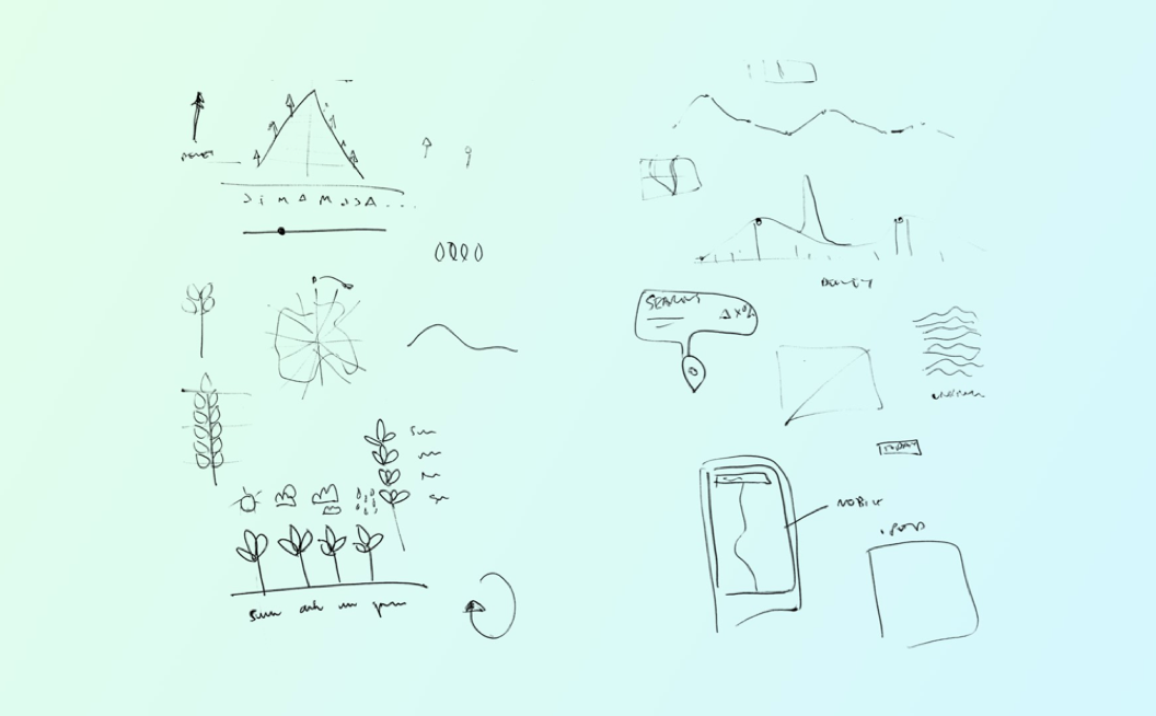
Some early sketches looking at displaying the data as leaves, trees, a mountain, a river (and the ‘Unknown Pleasures’ rip-off )
Then, given the fact that the data spanned several years, and that a line chart looked (sort of) like a river (and *cough* the Library sits on the bank of a river) I started thinking about the amazing maps drawn of the Mississippi by cartographer Harold Fisk, and how it changed over time (see below), as well as LIDAR scans which used lasers to show a similar thing. These in turn got me thinking about using the metaphor of a map to search and explore the virtual ‘landscape’ of the data.
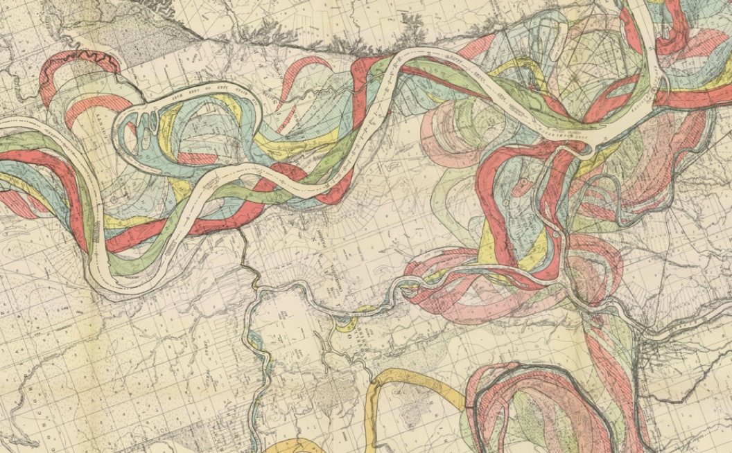
One of Fisk’s drawings of how the flow of the Mississippi changed over the years. More images here
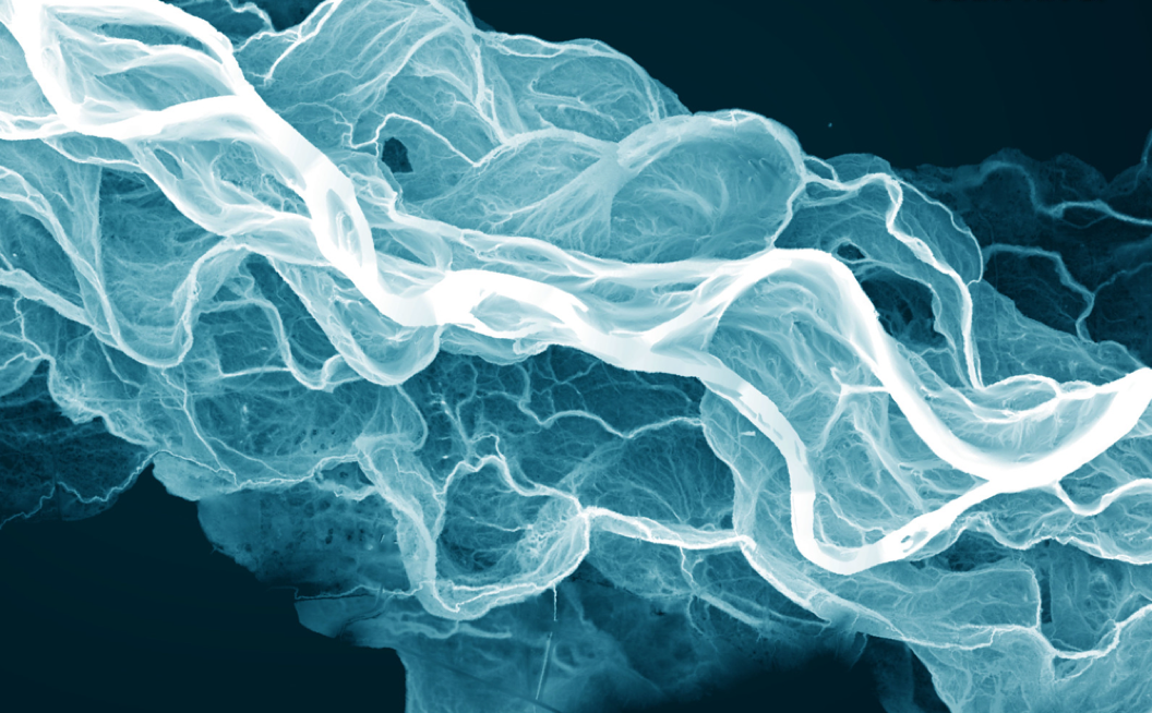
LIDAR-derived relative elevation model of the Sauk River, USA. Image by Daniel E. Coe, Washington Geological Survey. Original image here
Obviously, given the size of the dataset - there were almost 7 million unique searches from the beginning of 2012 (when tracking with Google Analytics began) up until the beginning of 2021 - choices had to be made about what to show, what to prioritise, what to label etc. But this too is like a map, which are, by necessity, an oversimplification of what they are trying to represent. But their benefit is that they can provide a more accessible overview of some of the key features of an area at a glance, in this case the searches made by people using the library catalogue over time. Plus, my hope was that by using a map motif, it would encourage people to explore.
As is so often the case, there were a whole bunch of ideas and approaches that didn’t end up in the final thing, and for a while there, learning absolutely nothing from Google's failure, I was actually toying with there being a (crude) predictive component to this. There was also a part where the user could draw a line on the screen, and they’d get back the words and phrases that best matched the pattern of that line. Plus a section that would attempt to determine the words and phrases most typical, or more likely to occur, in particular periods of time rather than others using TF-IDF (Term Frequency - Inverse Document Frequency). And a whole section looking purely at punctuation (see below), and a section comparing what words and phrases people were using to search Google vs what words and phrases people were using to search the State Library catalogue, as well as a section looking at the different parts of speech used in searches: nouns, verbs, adjectives etc. But at some point, in order to end up with something that vaguely works as a cohesive whole, choices needed to made about what ultimately to include (plus, er, some of the things above were proving rather time consuming, and I needed to set aside a chunk of time to learn how to set up and query a database, as I’d never done that before, and given the amount of data, I clearly needed one for this project…).
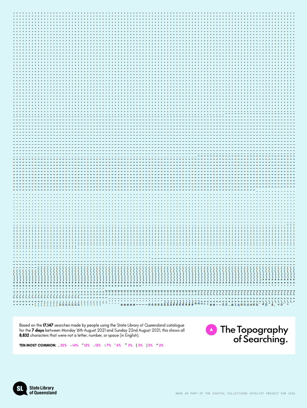
A breakdown of all the punctuation used in the searches for a week in August, 2021.
Anyway, the next post is on some of the coding and design choices about how best to display the data, especially the topographic contours.
~
* as a terrible speller and sloppy typist myself, I was interested to see what mistakes others made, and sure enough, the ones I made the most throughout this project - ‘seach’ and ‘libray’ - were in there (82 and 64 times respectively at last count)
** As an aside, I actually have a 20-year bet running with a mate, that I foolishly made in 2004, that by 2024 no one would use capital letters anymore. Now although I’ve accepted that I’ll lose the bet due to the timeframe, I still maintain that my rationale is sound, and that capital letters are becoming used less and less, and was thinking that maybe I could use the data over this period to test my theory, and see if the use of capital letters was decreasing (and I will pay my bet Soph!).
About the author
Brett Tweedie is a data visualisation designer with degrees in media and politics, and has been making stuff online since the late 90s. He was a Google News Lab Fellow (2018), shortlisted for the DX Lab Fellowship at the State Library of NSW (2019) and has produced a range of work for organisations in the GLAM sector, most recently creating We Are What We Steal for the State Library of New South Wales. He has also worked with the Museum of Applied Arts and Sciences (MAAS), the Museum of Australian Democracy (MoAD), and media organisations such as the ABC, The Australian Financial Review, The Conversation, and The Guardian.
State Library created the Digital Collections Catalyst initiative for developers and creatives to support innovative and creative uses of our digital collections and collections data. We are interested in highly creative and experimental ideas that bring together technology with cultural heritage to inspire Queenslanders through State Library collections. Learn more about the Digital Collection Catalyst initiative here.
Comments
Your email address will not be published.
We welcome relevant, respectful comments.