Visualising linked data from 'A biographical record of Queensland women', 1939
By Rachel Merrick, Coordinator of Digital Library Initiatives | 8 March 2021
After celebrating Open Data Day on the weekend, it is the perfect opportunity to talk about making that open data linked! Linked Open Data is a way of structuring the data that is put online so that concepts and facts can be automatically connected and enhanced for the end user across the internet. It is a long-standing buzzword in the web and data communities, especially for GLAM institutions (Galleries, Libraries, Archives, and Museums). There are many great introductions out there, but I recommend beginners watch Europeana’s introductory video explaining what Linked Open Data is.
Those of us working with metadata and structured data have talked about the potential for improving search and discovery through linked open data for years. Interested State Library staff participated in a book club to discuss Linked Data for Libraries, Archives and Museums. We took a ‘Linked Data for Beginners’ university course to get hands-on experience working with the language of linked data – RDF, OWL, SPARQL, SKOS, and BIBFRAME. We loaded our public libraries directory to Wikidata as a pilot to learn the benefits and costs of using the platform. We drool over organisations who implement their own linked data experiments.
Moving our massive collections to a new linked open data environment is a large, complicated transition that affects almost every branch of the library and is full of technical challenges. But, as this sign on my desk reminds me – Perfect is the enemy of good – and starting is the best way to make progress.
![Perfect is the enemy of good. - Voltaire [in French as 'Le mieux est l'ennemi du bien']](/sites/default/files/styles/slq_standard/public/perfectenemygood.jpg?itok=63WUQTWv)
Perfect is the enemy of good. - Voltaire [in French as 'Le mieux est l'ennemi du bien']
So, we decided to jump straight in and learn through practical experiments with our collections by evolving from failures then doing it again. We don’t know what we don’t know, but we are armed with preliminary knowledge, access to a variety of data experts, and an eagerness to figure it out. This blog is the first in a series where I will document the journey.
A biographical record of Queensland women, 1939
Our first case study comes from an interesting source of historical data, that the library digitised just in time for International Women’s Day – A biographical record of Queensland women, 1939. The book contains over 160 profiles and portraits of ‘notable’ Queensland women, including doctors, lawyers, nurses, philanthropists, and socialites. Each personal profile includes information such as education, occupation, charities, clubs, awards, relationships, and hobbies. It was the perfect opportunity to create a visualisation of these women using their portraits and the wealth of information about them in the book.
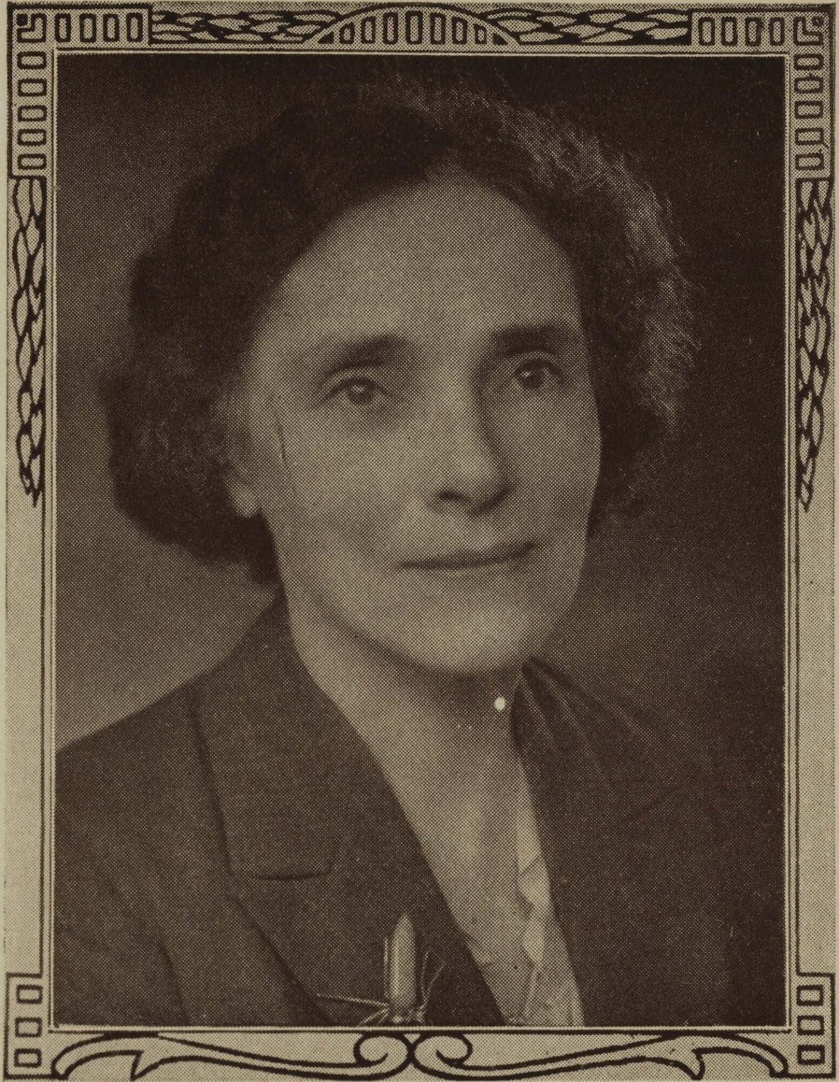
Portrait of Dr. Ellice Ettic Peden Dart, B.A., B.Sc., M.B., Ch.M. (Sydney)
These women were chosen by an advisory committee for their philanthropic and charitable work. While it is valuable to highlight women’s history in Queensland, we acknowledge the narrow lens of this selection, and prevailing cultural norms from that time – the women are overwhelmingly white, wealthy, educated, and upper class.
Review of available tools
The challenge of creating a linked open data visualisation for A biographical record of Queensland women, 1939 is multilayered. I want visualise relationships in the data about these women (family, education, hobbies, etc.) in an interesting way. This visualisation is key to help explain the ‘why’ we are changing the way we think about and format data. But I must also investigate the structure, schema, and platform for hosting the data itself.
I reviewed the landscape of existing tools and visualisations, including those outside the GLAM community. I thought surely there would be network diagrams used in other contexts/industries that follow the principles of linked data and the semantic web. Ideally, a tool that lets us “plug and play” without committing significant resources or require customised development. So far, after investigating around 40 different available tools, that perfect tool seems to be wishful thinking.
Some visualisation tools let us approximate the look of linked data, without storing or using linked data triples. (A linked data triple structures a statement in three distinct parts to make a ‘fact’, e.g. The sky – is the colour – blue. This structure is what allows for enhanced connections and queries.)
Flourish
Flourish is a free visualisation tool that specialises in dynamic and interactive content. It doesn’t require any coding or software installation and you can upload your data as a tabular spreadsheet. I loaded our data in two sheets – one to detail the qualities and statements of each person and another to detail the relationships between those people.
It approximates the look of linked data relationships in one direction (women and their family relationships), but can’t be downloaded, connected, or added to by other linked open data. We also can’t add or switch between additional entities to explore. For example, I can’t see one woman’s education at Brisbane Girls’ Grammar School and then navigate to the institution to see all the former students of Brisbane Girls’ Grammar School.
Ultimately, it struggles to handle the breadth of information we supply, and the formatting makes poor user experience for the interactivity we are seeking. However, it would be a useful tool for smaller visualisation jobs.
Power BI with Drill Down Network visuals
Power BI is a business analytics tool from Microsoft that integrates interactive visualisations with business data and allows users to share dynamic reports and dashboards. As we already have Power BI at State Library for internal data uses, I was pleased to find a network visualisation that plugged into my existing environment easily and allowed me to highlight the fabulous digitised portraits.
I again loaded the data as a tabular spreadsheet with two separate sheets – the qualities and statements of each person and the relationships between those people. Then I set a one-to-one relationship on the unique IDs between those sheets, allowing Power BI to automatically associate data connections for the IDs.
Power BI comes with access to a massive visuals library that can be combined into custom dashboards. Visuals within a dashboard can then interact with and filter each other. The Drill Down Network Pro visual from ZoomCharts allows us to load two relationship layers for the women at once (e.g. family relationships and club/charity memberships) and fully customise how it will display. I added interactive drop-down menus to the dashboard to view the chart filtered by education and occupation. Then I combined this network chart with several other visuals that update data when a particular woman is selected. This includes their name, portrait, a map of where they lived, and a list of their relationships.
Make this visualisation full screen, zoom in, select new purple boxes, and play with the drop down filters for best effect!
The customisation in the dashboard can include any combination of Power BI visuals, but it is limited by the fact that it isn’t true linked open data. We can only view from the primary perspective of statements about the women and can’t switch easily to statement about the organisations. We can also only associate a single instance of a statement with each woman. So, you can filter to see the four women who ONLY attended Brisbane Girls’ Grammar School, but that filter is separate from the filters of women who attended Brisbane Girls’ Grammar School and other institutions.
In terms of highlighting the digitised portraits that accompany the structured data, this Power BI visualisation is the most interesting for our users so far. But it isn’t linked open data, so the search continues.
GraphDB
GraphDB is an RDF triplestore graph database, which means it is properly built to store linked data. It has a built-in knowledge graph visualiser based on SPARQL queries – one of the key technologies of the semantic web. The free version of GraphDB offers several interesting features to play with, but at a much steeper learning curve since I need to properly structure the linked open data.
Helpfully, GraphDB is packaged with ‘OntoRefine’ – a customised version of the freely available OpenRefine that helps convert your tabular spreadsheet data into linked data triples. I can connect the columns from my spreadsheet of structured biographical data to existing schema from schema.org, RDF, and Wikidata.
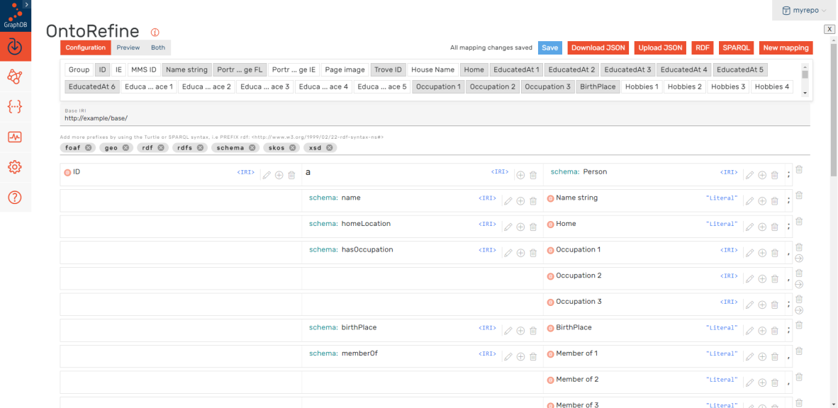
Screenshot of OntoRefine RDF conversion mapping
Using this mapping, OntoRefine generates RDF triples from my data, ready for queries and visualisation. This is a very rough beta version of linked data triples, as the triples are created specifically for use within GraphDB. The statements currently have a fake base IRI of ‘http://example/base/’, so while they work within this software they can’t be externally linked. The same is true for using text strings, like ‘Nurse’ in the occupation column instead of true IRIs.
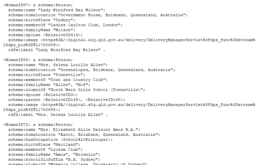
RDF triples generated by OntoRefine
Once I have the data as RDF triple statements stored in the database, I can run SPARQL queries and visualise the data. GraphDB allows you to construct a variety of queries that set the starting point and boundaries of a specific visualisation. For example, I could choose to start with a large overview of the entire knowledge graph or start zoomed into a fixed node that a user can expand.
Inside the graph, users can navigate the map, move around each node/entity, and drill deeper to find the triple statements describing the entity. I haven’t figured out yet how to display clickable URLs in the graph (like a Trove Persons URL) or if I can display the image itself instead of just the image URL.
Unfortunately, GraphDB is not set up for sharing these visual graphs except with other user accounts managed by the database. Ideally, we want to embed visual graphs on our website for the public to interact with.
Next steps
It will take more experimentation, trial and error to perfect our data for true knowledge graphs to display as we want and work as proper linked data. The next step is to ensure every person, geographic location, and concept are structured as linked data items in an existing schema instead of just text strings. As I have experimented with Wikidata previously, that will be my first test case for this work. State Library is excited about the possibilities with incorporating linked open data and knowledge graph visualisations into our collections as data approach.
What linked open data tools and processes have you experimented with? We would love to hear from you and build on our linked open data experiences together!
About the author
Rachel Merrick is Coordinator of Digital Library Initiatives at State Library of Queensland. She helps the State Library deliver innovative digital services for an evolving online environment. This includes the release of structured open data for use by developers, creative artists, researchers, and library staff. Rachel encourages GLAMR institutions to harness their data-rich digital collections of photographs, maps, manuscripts, videos, and more for re-use in computational environments.
Comments
Your email address will not be published.
We welcome relevant, respectful comments.