Writers are always collecting. Ideas for stories, poems, and books can come from anywhere. Things writers see or touch or read can return – sometimes unexpectedly – in the future to inspire them.
State Library is filled with treasures and curios. In this new series, we invite authors to find an item in our collections that inspires them to write a new, original creative piece of work.
Simon Groth is an editor and author based in Brisbane. He's passionate and curious about different modes of storytelling and an expert in technological advances and challenges in the publishing industries (and he has a thing or two to say about FONTS).
His latest book, published in April, is Ephemeral City. It's a collection of short stories about many things, including what objects can reveal and conceal. So it's a pleasure to have Simon contribute an original piece of fiction – about an object he's found – to our blog.
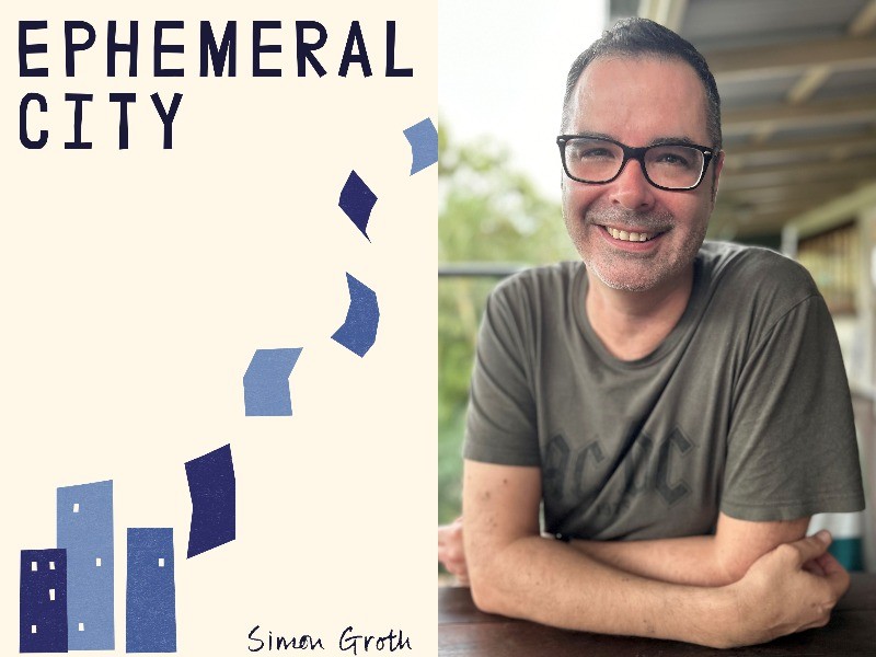
Simon spent time at State Library researching the stories of Brisbane to write Ephemeral City. Image composite: cover by Tiny Owl Workshop, photo of Simon supplied.
Finders Keepers is such a good fit with my book Ephemeral City, a work of fiction that collects eight stories and nine pieces of ephemera all set in Brisbane from the 1930s to the 2010s. The finished product is a bit of a treasure trove, a box of stories to explore any way you like. Quite a few of the pieces of ephemera in the book are adapted from real items in the State Library’s collection.
I decided that my Finders Keepers post should be a small extension of Ephemeral City so, as my starting point, I chose a very minor character from the book and a historical period the book skips over. If you’re familiar with the book, you might be able to guess the who and when.
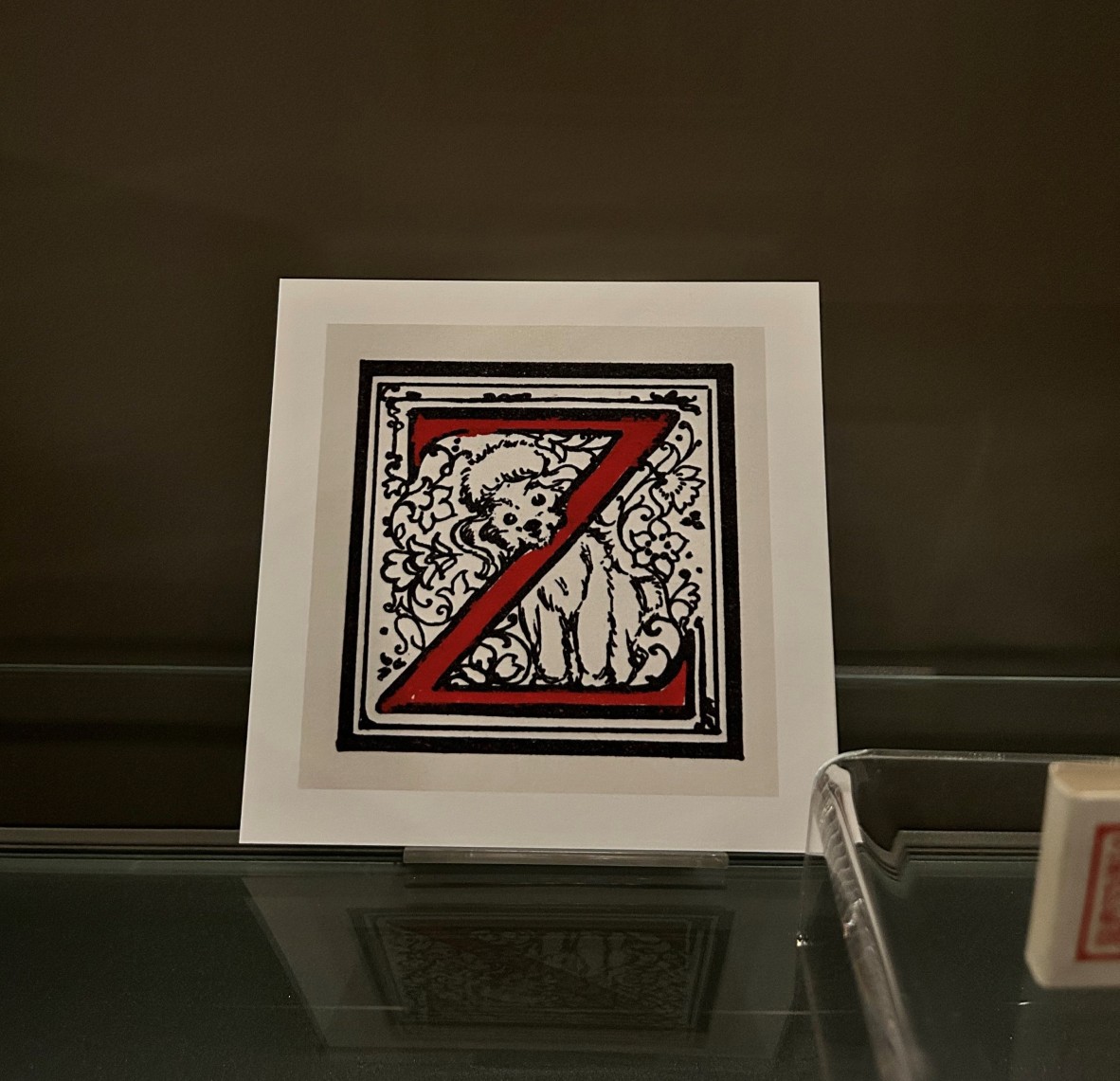
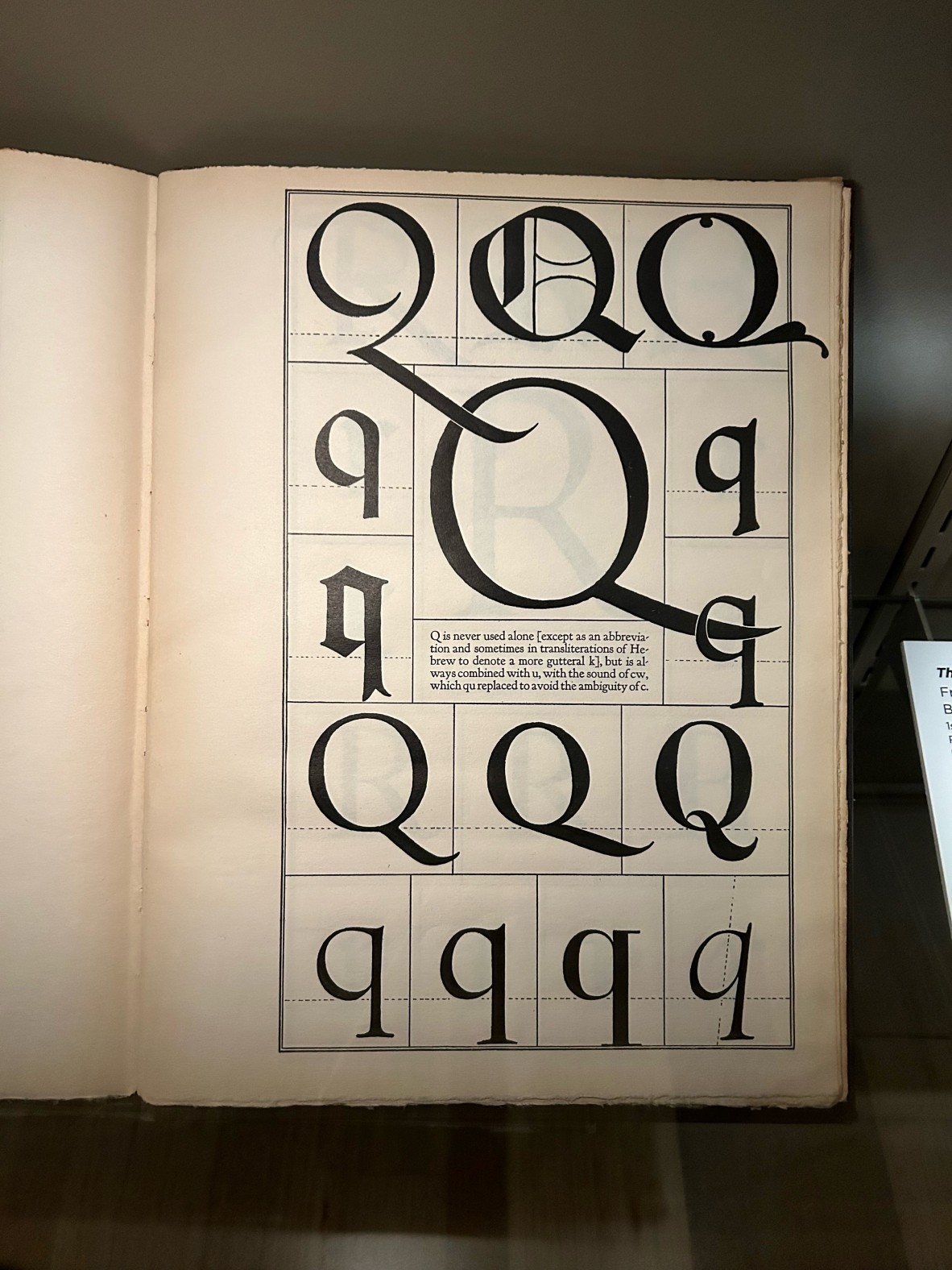
I visited the Australian Library of Art Showcase on Level 4, State Library. The current display, A is for Ox, explores the art and history of typography.
I’m enough of a typography nerd that I insisted on using an obscure early twentieth century typeface for Ephemeral City purely because it’s a font with a wild backstory of betrayal, petulance, and river salvage. It’s worth looking up if you’re into that sort of thing. So this exhibit was very much in my wheelhouse. There, I was drawn to a poodley Z from a children’s alphabet book and a page of fantastic Qs.
The elements were all there.
I’m enough of a typography nerd that I insisted on using an obscure early twentieth century typeface for Ephemeral City [...] So the A is for Ox exhibit was very much in my wheelhouse. There, I was drawn to a poodley Z from a children’s alphabet book and a page of fantastic Qs.
'Love Letter'
by Simon Groth
It took longer than she expected for him to see the letter. Emily had been pretending to work for an hour or more, her anxiety mounting as she watched. By the time he picked it up from the upper case of his work station and held it in his delicate ink-stained hands, she had worked herself into a state – unfocused, dishevelled – but here, finally, the promise of relief. She dropped the pretence of work and studied his reaction. He whipped his head around left and right, blinked rapidly as he looked straight past her. Was that expression wonder, confusion, fear? Before turning back to the letter, he straightened his tie with his left hand, a familiar nervous tic. She held back the urge to smile at that.
***
When she was little, Emily would trace the shape of alphabets with her fingers. Her appreciation only grew with age as she marvelled at the subtlety of black marks that conveyed such deep intent: sturdy, elegant, officious, whimsical. When she left school, she immediately gravitated to the world of printers, newspapers, and publishers.
The typing pool here was adjacent to the presses and Emily quickly manoeuvred herself to be near the typesetters. She would ask questions about the machine, the choice of typeface, the sorts and spacing, but the men on the floor had little time for her. They would typically chuckle and wave a dismissive hand in the direction of the Underwood Electric on her desk.
‘Stick to that kind of type, love.’
He was the exception.
Starting at the company just after her, Zachary was an apprentice who, she quickly realised, shared her passion. He relayed to the typographers both Emily’s questions and their now-considered responses back. He let her borrow a sample book from the floor and there, Emily learned the refined elegance of Baskerville, the daring sharpness of Futura, and the audacity of the crisp, contemporary Neue Haas Grotesk.
There too she discovered the names: Bodoni and Garamond, Frutiger and Hoffman. Typefaces did not exist through some divine edict. They were designed. Yes, by men, but still the possibilities were open.
‘Always look at the Qs,’ Zachary once told her. ‘Every design is all about sticking to the rules, but look at the capital Q, look at those tails, that’s where the designer lets loose.’
He wasn’t wrong. She absorbed the baroque flair of tails and swashes, but her mind never strayed far from Zachary: excitable eyes beaming behind the counter of round glasses, the stray ascender of hair at the back of his head, the sharp spur on his jawline when he smiled.
She sketched out the letter – just one – over and over, observing each iteration’s symmetry and balance, before starting work proper.
She traced the perfected form over the woodblock before meticulously carving out the negative space around it.
Z.
Hardly a complex design, but Emily threw herself into the task: a heavy stroke at the perfect angle and playful oblique terminals. Sans serif, it absolutely had to be sans serif.
She made the paper, reconstituted from scraps to create a warm texture to hold the letter. The ink was a strong carbon black, decisive. She fashioned a press using an atlas and a dictionary held together with clamps from the hardware shop.
And, when she was done, she took a moment to consider the beautiful thing she had made for him. She wrote nothing else on the paper, simply deposited it at his station.
And she waited.
***
Zachary held the paper up, admired it through light from the windows. She rested her head on her hands and squinted at him. Was he returning her gaze from the corner of his eye?
He held the paper to his nose and, almost imperceptibly, he smiled.
A weight lifted from Emily’s shoulders and she dared herself to hope.
Zachary folded the letter carefully and placed it in his waistcoat pocket. And he went back to work.
Emily’s cheeks burned. She looked down at her typewriter, at the nonsense she had been absently writing to maintain the illusion of working. Variations of Zachary’s name appeared at regular intervals on the page.
Tonight she would start work on the next letter. She could already picture the elaborate tail of the Q.
Love typography now too? Learn more in these quick explainers via 99% Invisible podcast: one about Futura font and one about Check font.
Simon Groth is a writer and long-time observer of publishing, technology, and creative industries. His books include collections of rock music interviews, remixed short stories from the nineteenth century, and a novel whose order of chapters is randomised between copies. His reporting on the technologies of publishing has seen him travel the globe to discuss and explore the challenges and opportunities for writers and readers in a hyperconnected world.
Comments
Your email address will not be published.
We welcome relevant, respectful comments.