The Topography of Searching, part 2: Making the contours.
By Brett Tweedie, Digital Collections Catalyst 2021 | 29 March 2022

Digital Collections Catalyst 2021
Brett Tweedie shares his inspiration for
The Topography of Searching
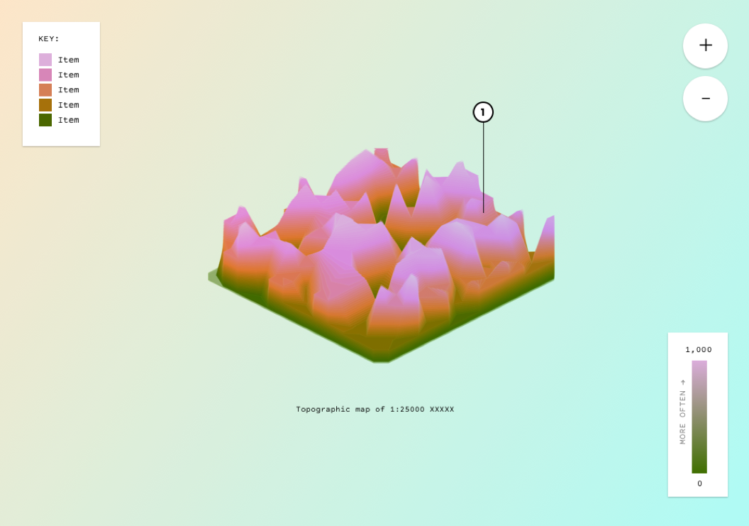
As mentioned in the previous post, I played around with a bunch of ideas (some better than others) about how best to present the data (leaves, trees, hills, islands, rivers etc), but in the end I settled on a topographic map. For this to work as intended though, I needed a way to actually convert the search data - a period in time, and a quantity - to topographic lines. Just so i knew i could actually deliver something at least vaguely along the lines of what I’d promised, I wanted to make sure I had some sort of fallback in case I couldn’t end up getting together a decent topographic map, so I started out playing around with a few other ways to present the points (was ready to call it ‘The Topology of Searching’ if needed and hope that no one noticed…). One of those was using a mesh-like landscape using Three.js. After a bit of playing around, I had something that I reckon could work at a pinch, and so with a fallback in place and panic subsiding, I thought I'd now have a crack at generating a proper topographic map.
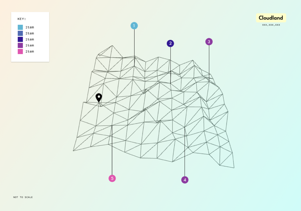
A rotatable mesh generated map via Three.js (the data was just random at this point, it was more about being able to generate a landscape of sorts)
The trick was that it had to work with all sorts of data, and quickly (i.e. not take too long for the map to render). I found a few javascript based functions and they sort of produced a topographic-like layout, but they weren’t that great. The first attempt was using an old school method called the CONREC contouring algorithm that had been ported to javascript (the coding language I’m most comfortable with) and that sort of worked, but it was a bit slow, and seemed to struggle with larger data sets (or perhaps that was just my ham-fisted implementation, as I will admit I wasn’t entirely sure whether I was formatting the data correctly in parts...). There was also a brief detour, where rather than use a javascript library, I had a play with just writing a custom function to convert the data to x,y,z points (and lines) in an isometric view. After dredging up a bunch of high school maths, I had something workable, but put it aside in the end, as I still wanted to have properly generated contours (or at least have a better crack at attempting to make one…). Oh, and another fallback was using the location and/or size of trees to show the differing density of search terms (see below).
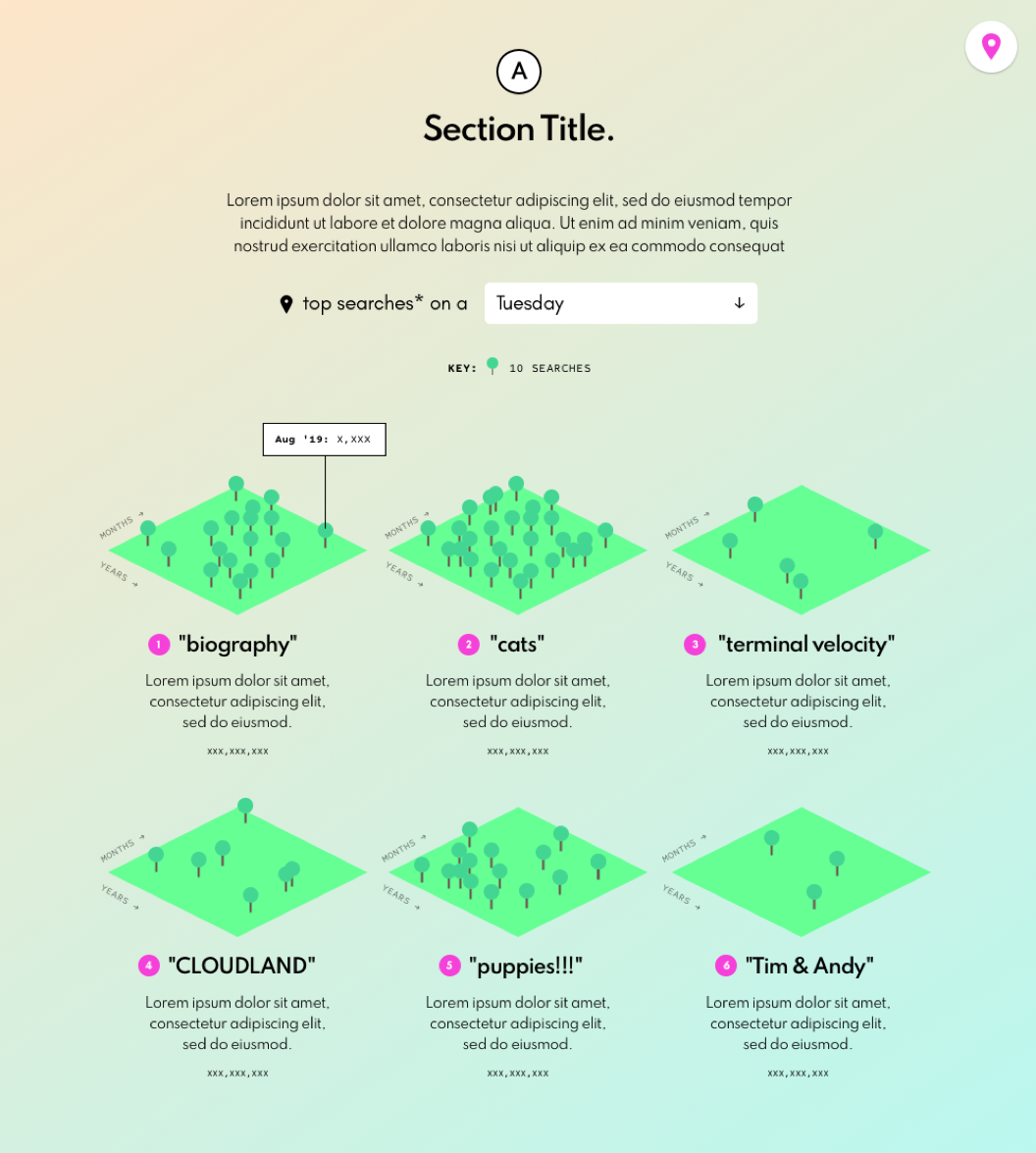
Another one of the fallback approaches if I couldn’t get a decent topographic map was to use trees to show the density of search terms over time.
Then, rather sheepishly, I saw that D3.js (the javascript library I, um, already use for data visualisations) actually has a contours component built in (helpfully called contours). It creates a GeoJSON MultiPolygon geometry object based on thresholds you can set, and a few other editable parameters. By playing around a bit, it produced some decent results. The lines were a bit rigid though, so didn’t have the smoothness of actual topographic maps that I was after, but given the generated data was in GeoJSON, it was easy enough to use d3’s line methods to smooth them out (you can see the different types of curves available in D3 here).
To get the data into a grid the values simply get wrapped, with zero values added to complete the rectangle if there is no data for those months. In the end I also added zero values around the whole dataset to give less abrupt peaks at the edges, and played around with whether to smooth the monthly values by taking a 2, 3, or 4 month average, but in the end I left the values as they were (but values are normalised, so that by default they show the ratio of the number times the search term appeared compared to the total searches that month).
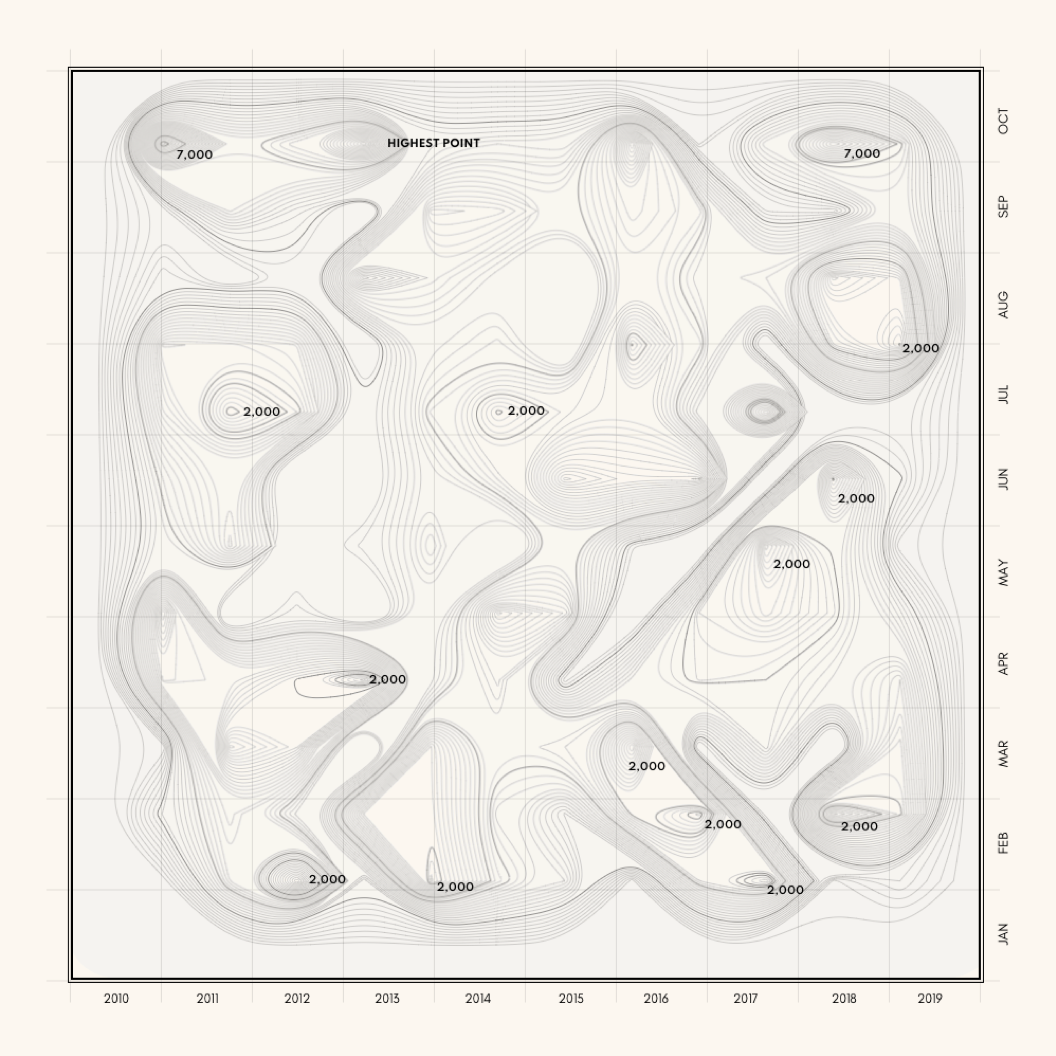
An early version of the map for searches with the word ‘family’ in it.
I then took the multipolygon and split them into individual polygons. In the GeoJSON that d3 produces, there’s just one multipolygon for each level, whereas the way I had in mind to mark the peaks (with a dot), I needed each polygon to be separate, so I could find its centroid (I also wanted them separate from an interactive point of view). Again, there’s probably a better way of doing it, but I just marked the peaks by running through all the polygons from the bottom and checking to see if the centroid of the level above was within the bounding box of the the current polygon, and if not, that polygon was a peak and marked accordingly with the dot and its height. This was only done if the peak was greater than 25% of the maximum height, otherwise for some terms you ended up with way too many dots, as every peak was marked, not just those that were significantly higher than the surrounding terrain. There was also a bit of mucking around to place the dots and labels for the peaks at the right stacking level in the SVG, so that when viewed in 3D, they’d properly be obscured by any taller peaks in front as the map was rotated.
An early version of using the 3D transform of CSS to display an isometric map (line smoothing not applied yet).
I also wanted to have contour height markers, like those you see on proper maps (those numbers next to some of the contours lines to show the height of that contour), and had a bit of a play at placing them along every n-th line, but between working out the direction of the slopes across multiple contours, and then matching the distance along the contour from the origin of the curve, to placing the height, as well as the right direction to rotate the text to match the slope of the curve at that point of the contour, my code was getting quite unwieldy, and wasn’t producing particularly good results, so I gave up (again, there’s probably a better way of doing it).
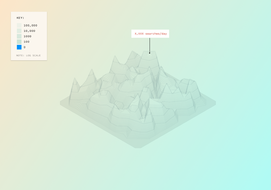
The other issue was how to scale it all. Originally I just wanted to have a single scale for the map, but the numbers of results varied so greatly depending on what was searched for, that that was proving problematic. For example, some searches might only have a few results, such as a mere 7 for the classic children’s series ‘Meg and Mog’ (I loved them as a kid, and am a bit surprised they’re so low to be honest) to almost 115,000 results for something like ‘history’ (and even more for words like ‘the’). Any scale that catered for a smaller number of results wouldn’t work well for a large number, and vice versa. I looked at using a log scale, and although that worked for showing the differences between results, it didn't work so well for showing the differences within a set of results, which I thought was the more interesting aspect, so in the end I went with a custom scale that uses the maximum height of the data as the maximum height of the map, in order to best show how a set of search results changed over the period.
After that I had a play around with a bunch of different colour palettes for the map. Some came from looking at the old topographic maps the library has, as well as trying to match the tone I’d cobbled together for my initial submission, and, um, some just ‘cos I thought they looked nice (I’m a sucker for pastel colours). In the early versions I was actually using unnatural colours such as pinks and purples (see below), but in the end, I went with something more natural, in order to make it (hopefully) easier to understand the height aspect (especially in the 2D view).
Playing around with unnatural colours for the elevation.
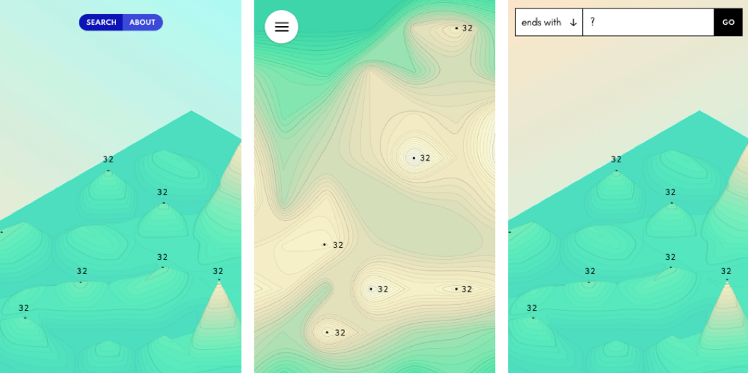
As for how best to show the maps online, I was initially unsure whether to generate the map via the HTML canvas tag or as an SVG, but basically I'm just more comfortable with SVGs so went with that. Plus I wanted to make the generated maps downloadable as an image, and I figured that working with vector images, such as SVGs, in other applications is much easier than working with pixel based images, such as the pngs or jpegs generated via canvas (and with an SVG, you can still convert it to a png, which I’ve added as an option, but with canvas, you can’t go the other way).
I also thought that by using SVGs I could take advantage of CSS’s 3D transforms to generate an isometric view of the map, and after a bit of playing around (and dredging up some high school maths again) I got the look I was after. There were a bunch of other things I looked at, such as whether the map should be zoomable (it probably should have been, but I ran out of time), and how best to show it on mobile/smaller screens.
Some minimalist mobile/touch designs which I didn’t end up doing.
In the end, the contours are generated based on monthly, rather than daily counts (although if you download the JSON, it has a daily breakdown). This was partly for the sake of speed, both to generate and download the data, as I was terrified that I might end up making the interface I wanted, only for it to take ages to load. But it was also so the grid would work in both directions, left to right (January to December of each year), as well as top to bottom (the same month through the years, such as April 2012, April 2013, April 2014 etc). Also, I just realised looking back on the initial data that the library has the searches bundled by month, so thinking about it now, perhaps that was also one of the unconscious reasons why I was thinking in monthly formats as well…).
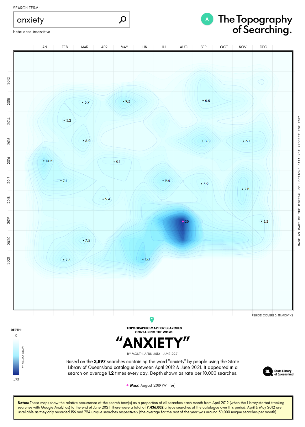
An early version using searches for ‘anxiety’ as a test, using ocean depth, rather than mountain heights, to represent the frequency of the term.
After having a play around with code, the next step was to test it with actual data and I was always a bit scared at this stage in case a) it didn’t work, or worse (if I’m honest), b) looked terrible. Along the way I posted a few of the images to twitter - the first four looking at the topographies of searches containing the words ‘bushfire’, ‘cyclone’, ‘flood’, and ‘drought’ respectively - but with my 260 followers, there wasn’t much feedback beyond the occasional polite like from supportive friends (thanks Cass!).
Some results were interesting because of what they showed on the map, such as clear peaks at particular points in time, whereas others were interesting not so much for the topography they produced, but rather because of the results they returned. Admittedly some were neither, but that’s to be expected, as, um, not all data is inherently interesting.
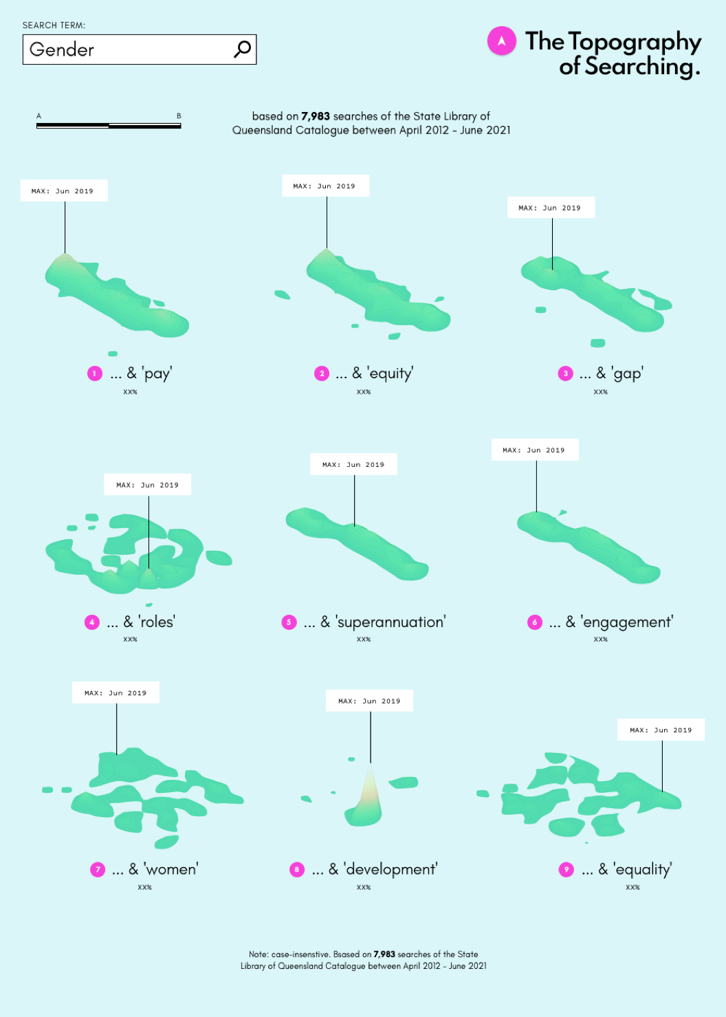
A version where the words or phrases would be islands.
The (probably rather obvious) point of all this is that - at least for me - any datavis project involves potential trade offs between the idea, technologies, and time/effort, and it’s been interesting going back over the old sketches and designs and seeing how things have changed over time.
About the author
Brett Tweedie is a data visualisation designer with degrees in media and politics, and has been making stuff online since the late 90s. He was a Google News Lab Fellow (2018), shortlisted for the DX Lab Fellowship at the State Library of NSW (2019) and has produced a range of work for organisations in the GLAM sector, most recently creating We Are What We Steal for the State Library of New South Wales. He has also worked with the Museum of Applied Arts and Sciences (MAAS), the Museum of Australian Democracy (MoAD), and media organisations such as the ABC, The Australian Financial Review, The Conversation, and The Guardian.
State Library created the Digital Collections Catalyst initiative for developers and creatives to support innovative and creative uses of our digital collections and collections data. We are interested in highly creative and experimental ideas that bring together technology with cultural heritage to inspire Queenslanders through State Library collections. Learn more about the Digital Collection Catalyst initiative here.
Comments
Your email address will not be published.
We welcome relevant, respectful comments.